I’m often asked, “What is it like to work with TED?” This is a question I love to answer, because TED is one of those rare organizations that truly has a culture of creativity. Everyone at the organization has an enthusiasm for design, from the staff, to volunteers, to the curator, Chris Anderson. This makes working with them a unique privilege—as well as a challenge. Everything we present is carefully scrutinized, dissected, and debated with a studied articulation. We are always asked for the story behind our ideas, and we’re pushed to do better than our best work. And, with that effort, we learn and grow.
Here are a few of the biggest takeaways from our design process with TED:
Avoid “The Big Reveal”
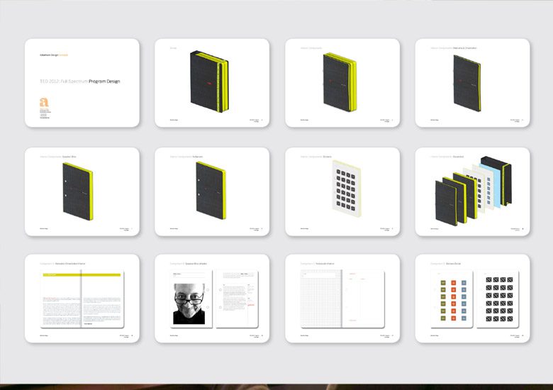
The best thing I learned from presenting to Chris Anderson was, Avoid The Big Reveal. Early in our relationship, when we were working on TED2012, I made a nice slide deck showing our thoughtful process toward design. My attempt to drive the discussion in a linear fashion ended on slide four. Chris just didn’t have the time or patience to wait for me to talk about each slight variation of our visual concepts or how we got there. He just wanted to see us there. The general feedback I got was “Try again.”
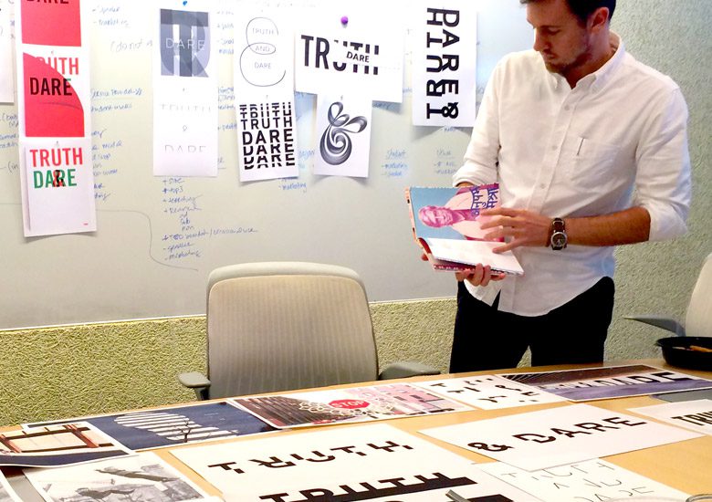
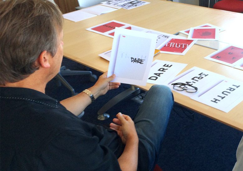
By the next meeting, I had figured out that our problem wasn’t a lack of viable ideas; it was a lack of flexibility. Rather than set up a linear presentation that culminates in revealing big ideas, I put up printed sheets around the conference room, showing everything at once.
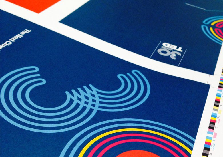
When we presented ideas for TED’s 30th anniversary in 2014, we covered the conference room with everything from logos, color palettes, signage, and interactive exhibits, to an ironic concept for a TED Museum. The meeting had its moments, but I left with a pretty clear design directive, which drove the development of what TED’s 30th anniversary should feel like.
It was an iterative and open-ended process, but over a series of presentations, we edited our concepts, reviving some, and deleting others. I kept bringing back ideas for a second look, if they hadn’t been killed outright. Perseverance and perfectionism paid off, and a shared sense of the decision-making process made the work stronger.
The Client Is Not Always “Right”
Working with TED is a true collaboration — not just because we have a design and editorial background in common, but because they have a culture as a media entity that challenges its audience. This may be unique to TED, a non-profit organization bent on sharing ideas worth spreading, but their way of engaging outside creative input is something all companies should adopt.
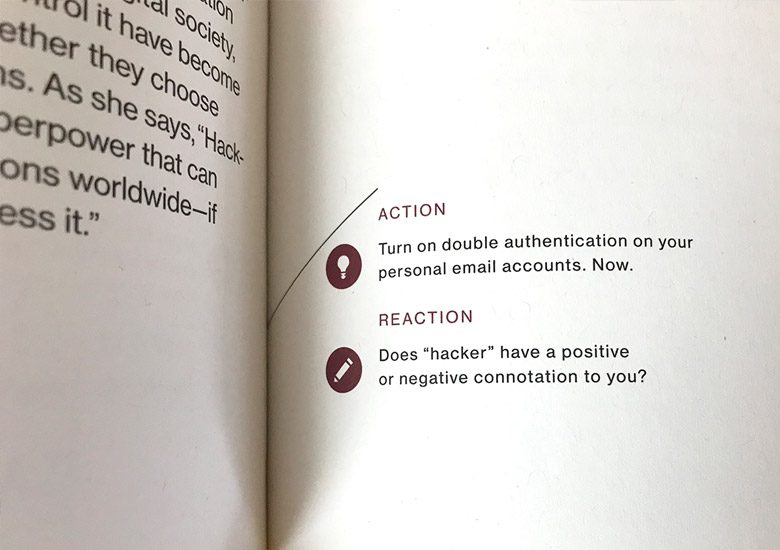
They know that their role as a client is not to dictate. They engage us with provocative positions, artistic inspirations, or just a good quote from a beloved children’s story. When creating the program guide, we had an idea to develop something we called Action/Reaction, a provocation to the TED community right on the pages of their intended notebooks, encouraging their reactions to speakers.
Weekly chats with Mike Femia, TED’s Director of Design, were especially fruitful. His insight into visual compatibility helped us tailor the color and texture palette to the physical event space, and his love of typography led to some inspired discussions, and bold product.
Find Great Vendors and Trust Them
Whether we are working on environmental graphics for TED, package design for a coffee shop, or new product prototypes, there’s always a budget, and a level of production value we have to push for. With anything we can’t produce from our own shop, there is nothing more important than working with vendors we trust, knowing that they will be able to implement and realize our designs. A key component of this relationship is that they will keep us one step ahead of the schedule, and if they’re good, they have a knack for anticipating our quality standards. There’s a thousand ways to get something done, and as designers, we try to consider every possible way to execute within budget. A good vendor will help you navigate this territory, and a great vendor will actually bring you new ideas to push the product beyond expectations.
