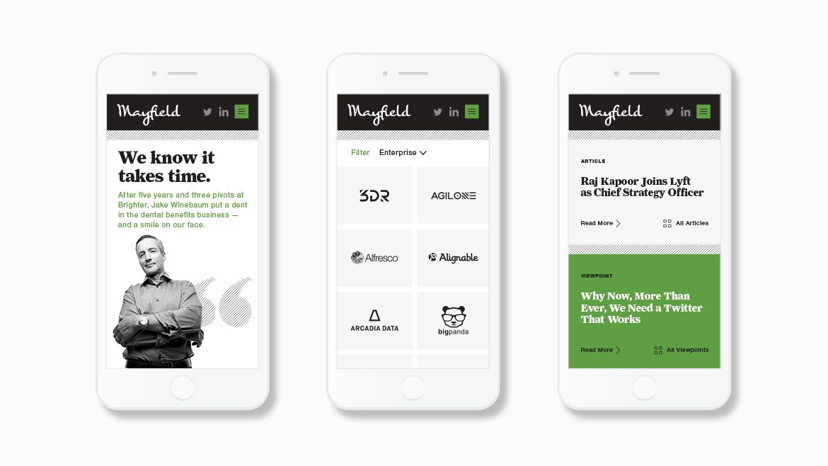
Sand Hill Road is the storied center of the world’s fastest-growing companies, home to some of the most prominent venture capital firms. Mayfield has been around longer than most of its Sand Hill neighbors, close to half a century since its founding back in 1969. That’s ancient in Silicon Valley, where companies reach billion-dollar valuations before they’re a tenth of that age. Mayfield’s confident long-view informs how its partners see the world of venture capital: find the right people, get their vision, and stick by them.
Relaunching Mayfield’s website required close collaboration with their VP of Marketing, Kamini Ramani, and a deep dive with their investing partners. Our objective was to clarify their unique investment philosophy, and to establish and support a consistent content strategy.
The first conversations allowed us to develop an essential sense of Mayfield’s point of view: that even before considering new technologies or new business ventures, they focus on the founders themselves. This focus informed our design explorations and subsequent workshops with Mayfield to refine messaging and align the site’s content. The site needed to speak directly to Mayfield’s audience of entrepreneurs, and to do so quickly. If they didn’t understsand Mayfield in the time it takes a Lyft to cross Sand Hill Road, we hadn’t done our job.
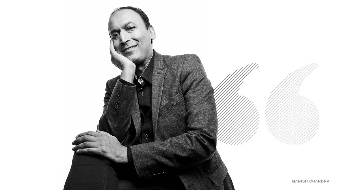
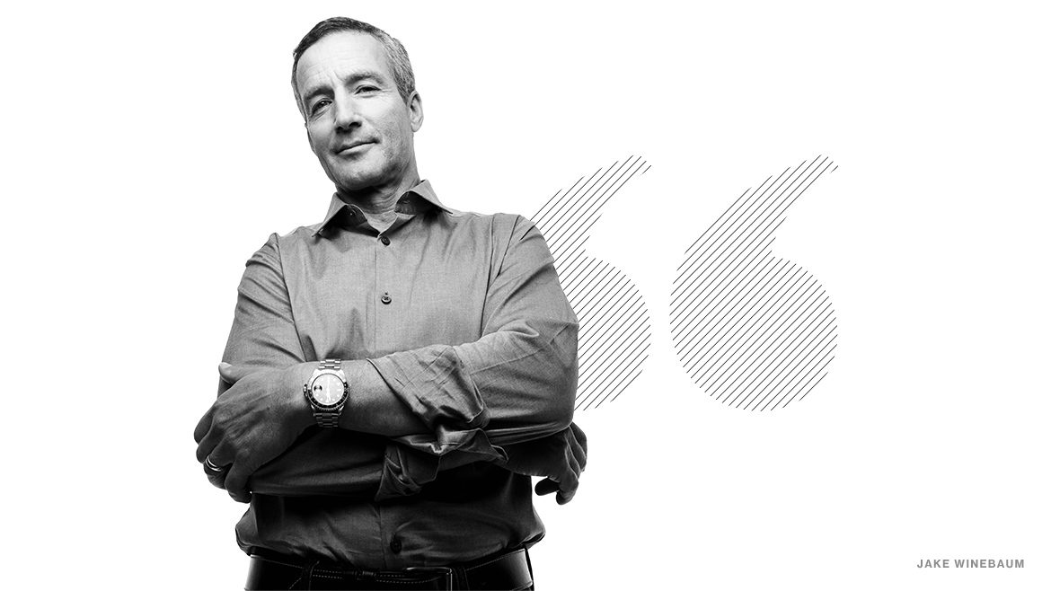
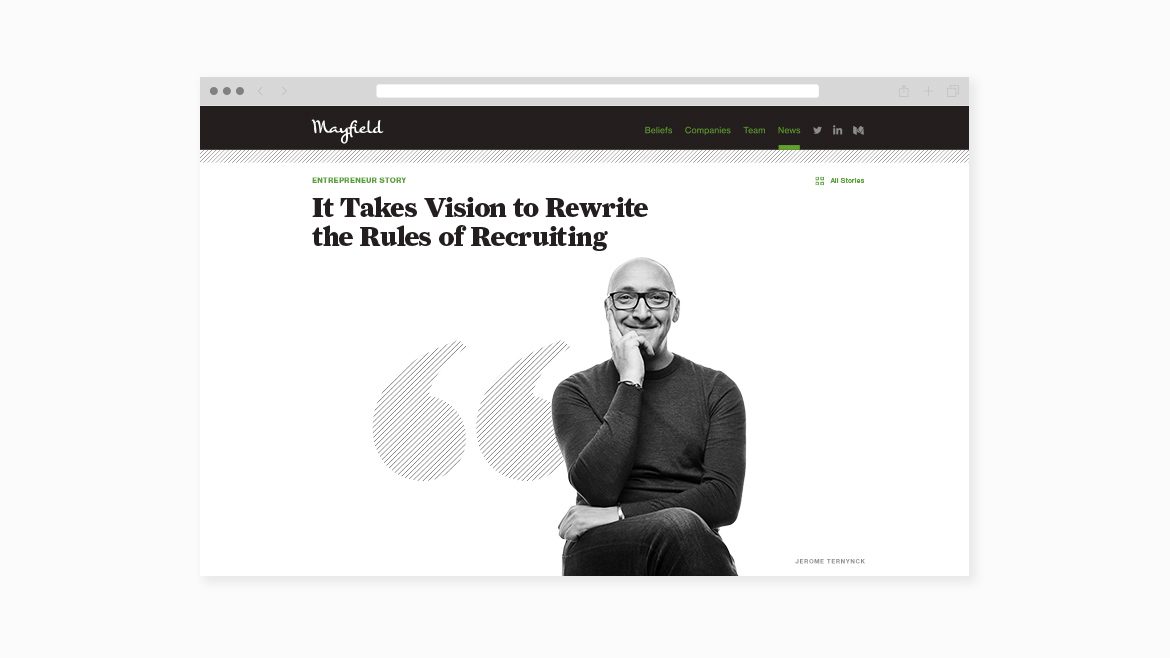
Our goal for the look of Mayfield’s website was to package it like a business magazine, featuring profiles of the entrepreneurs they have backed. These stories were delivered as journalistic content, conducting interviews and follow-ups as we wrote each piece. Black and white portraits of company founders were commissioned and art directed to be worthy of a spread in Forbes, and a minimalist design aesthetic was intended to lend an air of gravitas.
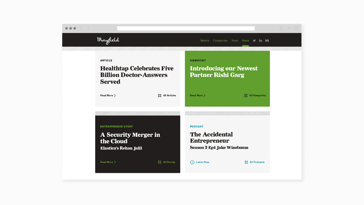
As the design took shape, we signed on to serve as ongoing editorial consultants. We work strategically to plot quarterly content, and to develop written and visual materials with the company’s various partners to express their vision of where technology is headed. These include viewpoint entries on the site’s blog, as well as features that have appeared on TechCrunch and elsewhere.
Revising and rebuilding everything except the logo, we folded in a regular newsletter, presentations, blog posts, a social media refresh, and ongoing editorial to maintain quality and consistency of the Mayfield message.
