Designing for visual identity systems is often a game of formal reduction: we take apart letters, merge shapes, look for patterns in repetition. A natural pleasure comes from the making of a puzzle that will become the visual components of a brand. We usually put these components in a metaphorical box: handing them over to our clients with strict guidelines for use (or in some cases, general encouragement for play).
This form of play is familiar to first-year graphic design classes, curriculum introduced decades ago by design educators trained in Bauhaus and Swiss Modernist traditions. The reduction of typography, line, shape, and color to their barest elemental components have given us masterpieces of brand identity.
Much of this reductive territory has been strip-mined by graphic designers over the years, leaving the likelihood of coming up with the next IBM or CBS logo doubtful. But, still this exploration into form continues to help inspire us to pleasing solutions, especially when creating patterns and textures to supplement an identity system.
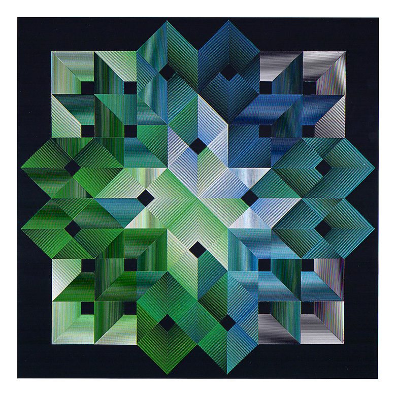
Toshihiro Katayama (1928—2013), graphic designer and Harvard educator, began some deep exploration this territory in the 1950s, later producing a series of large-scale artworks, all of which were based in this purity of elemental reduction:
“If one cuts a succession of L-shaped figures of a fixed width from two sides of a square, smaller and smaller L’s are created. Using the group of L’s for elements and rearranging them, I designed a poster in which the image of a moving arrow was produced. Whatever of the quality of that work, the discovery that I could design in this way made a big change in my creative approach. When I think about it now, I realize that many artists had already developed similar methods, and it is embarrassing to even say that it was a new approach for me. Nevertheless, the fact that I had discovered it myself, and not out of a book provided the stimulus, and like a fool who has had only one thing dunned into his head, I produced a design with this L-shaped element.”
“Recently I have come to believe that there are two types of creative processes, the positive and the negative. In the positive process, a person will collect as much information and tools as he can and then work with many collaborators. I work, however, by a negative process. The more I seek a purity of approach, the deeper I enter this negative world. I have come to respect the artist with his single-minded devotion to his own world more than the designer accustomed to doing group work.”
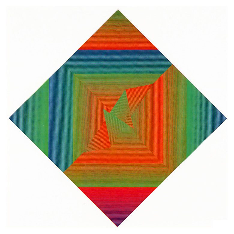
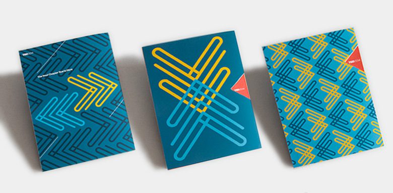
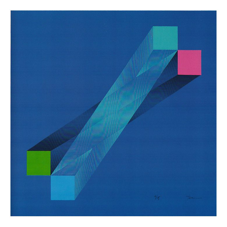
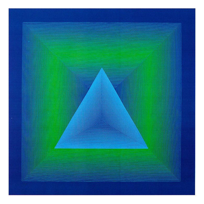
Here’s some of our work that derives pattern from letterforms, abstractions of movement, and one derived from the safety paper used for payroll checks.