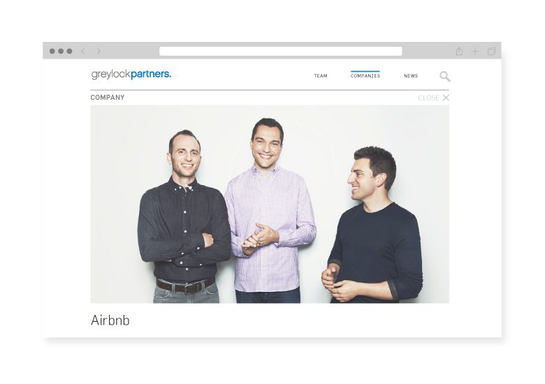
Greylock Partners is the storied venture capital firm that has backed such massive technology companies as LinkedIn, Facebook, Pandora, and Airbnb. And although the firm has been investing for more than 50 years, it continues to be one of the most modern, forward-thinking, and innovative VC firms in Silicon Valley.
We were approached by Greylock to completely redesign the firm’s website to better reflect their modern, straightforward culture. The design philosophy we developed after discussions with internal stakeholders and the CEOs of various Greylock portfolio companies can be summarized in one word: streamline.
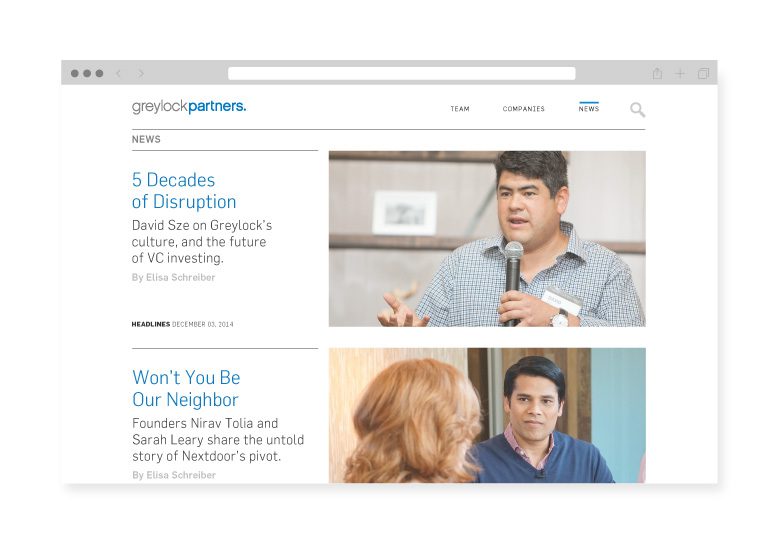
Every decision we made had to be filtered through the lens of producing clean, streamlined, beautiful design. We focused on ways we could use high-quality images to tell a more human, engaging story using fewer words. We edited mercilessly; we included only the content that mattered and avoided content creep at all costs. And we focused on making it ridiculously easy for entrepreneurs to find the information they needed, with minimal clicks to get there. We developed an approach that every step of the way kept things streamlined: a simplified interface, a limited overall number of pages, a clean and spacious layout, and on the homepage a handful of microinteractive engagements.
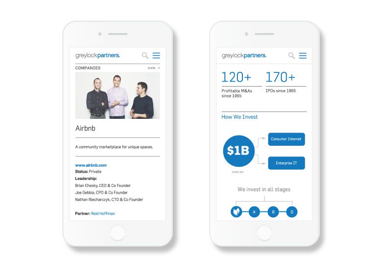
In addition to the streamlined design, Greylock needed a site for a mobile-first world. Of all the discussion topics that surfaced during discovery, one that really stuck with us was when we were told that many visitors look at the site while in a car on the way to a meeting with a Greylock team member. We started with that mobile view, and worked our way out to the full-scale website. The idea of mobile first gets bandied about a lot in web design, but in this case the approach was specific to the dominant use case. We built a site that is just as easy to use and as beautiful on a mobile device as it is on a computer.

At any given time, Greylock has more than 80 active portfolio companies. It has always been a core tenet of the firm’s culture to put the entrepreneur first and do everything possible to support those companies. With this in mind, we built an incredibly lightweight and simple CMS so the Greylock team could update their landing page with portfolio company news. The build was so successful that the internal Greylock team is able to update their landing page within minutes, and the portfolio companies are requesting promotion on the site regularly.
And lastly, whenever possible, we used the platforms of the companies that Greylock has backed. For example, instead of building a stand-alone blog for company news, we designed a repository of clickable headlines that pushed traffic to Medium and LinkedIn. In fact, Greylock was one of the first companies to use Medium as the home for its company blog: at once supporting a Greylock portfolio company and innovating on how corporations share their news.

This partnership on the website led to subsequent work with Greylock, which asked us to develop a series of short videos profiling company builders in the firm’s network. The series is called Greymatter, and it is published exclusively through TechCrunch. Learn more about the Greymatter video series.

