Wall Street may have helped fund the rise of tech. But the industry that manages IPOs and stock trades—along with hundreds of billions of other transactions per day—is, itself, something of a technological backwater. Much of the infrastructure the financial industry runs on is 30—even 50 —years out of date. Add to this increased regulation, and the large banks that run clearing services are out of step…and a significant pain point for smaller trading operations.
Clear Street is a self-funded, Manhattan-based start-up that aims to make clearing a thing of the future, not the past. By rewriting the clearing process from scratch, and rebuilding a technology platform based on decades of shared experience among its team leaders and trading-floor employees, Clear Street has united access, speed, and efficiency.
We developed a brand vision that is rooted in the sobering complexity of infrastructure, but is very much a luxury product. Drawing from our intake with management and their clients, we laid out three foundational elements of the Clear Street brand: Practicality, Premium, and Innovation.
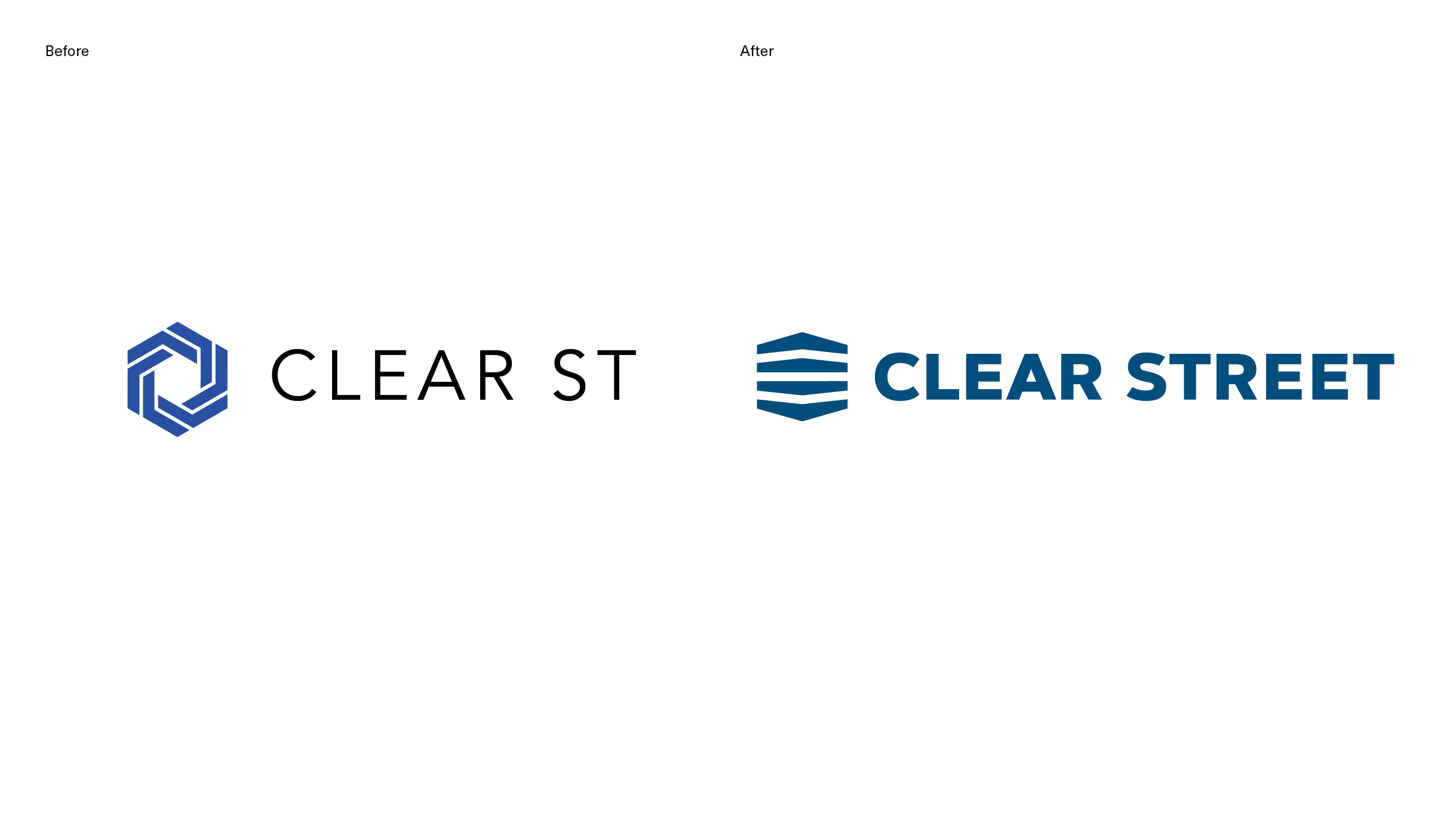
The new visual identity had to be direct: A bold and minimalist emblem marries the weightiness of infrastructure with the whipping speed of four horizontal stripes. The logotype follows suit: “Street” must be written out, not abbreviated. All caps instead of title case. And styled with a no-nonsense sans serif.
A complete brand asset library was assembled, with a broad palette of support colors for application across product and service offerings. We are still adding to this library of assets as we expand the number of brand touchpoints to web, collateral, and other supporting materials.
The brand was created with a rapid-paced and thorough process, in collaboration with Marketing Lead Kevin Morgan, who brought the project in for a smooth landing. Together, we helped Clear Street articulate how being practical can, in fact, engender a premium experience.


