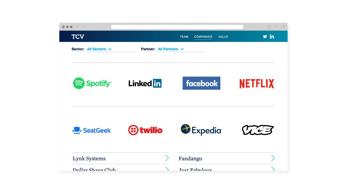
TCV invests in companies that are already proven concepts, yet are poised to scale up to market leadership. You might not think that companies like Netflix, Fandango, GoDaddy, and Dollar Shave Club ever needed help, but even a successful business model can find itself on an unclear path. Known for 20 years as “Technology Crossover Ventures,” TCV found it was time to simplify the brand and to level up with a strong message.
Through our research, including interviews with partners, and CEOs of key investments, we were able to distill TCV’s value to six elements:
- Tech Expertise (sole focus on technology; on first-name basis with everyone who matters in tech)
- Success (20+ years of experience; standout record)
- Active Partners and Board Members (high level of engagement; board adds real value; coaching; live by code of ethics and values; collaborative, fun)
- Growth (“We make $30M-$300M equity investments”)
- Versatility (global; flexible transaction structures; public/private crossover; courageous)
- Grit (persistence; commitment; best things take time; due diligence; solid foundation helps companies be fleet, nimble, vibrant)
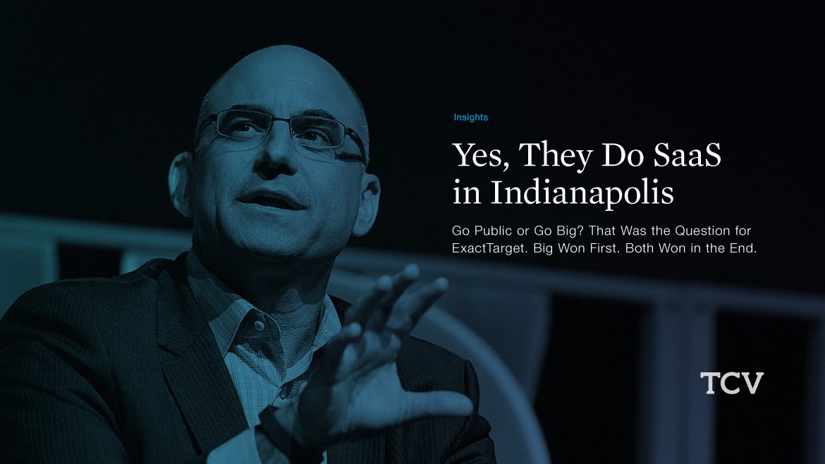
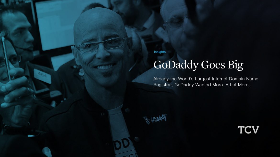
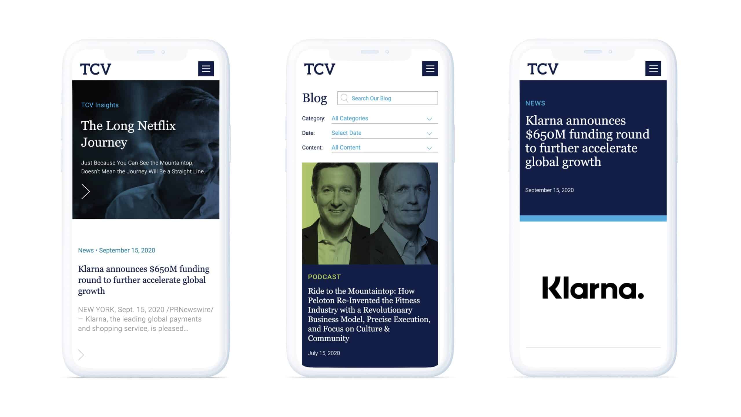
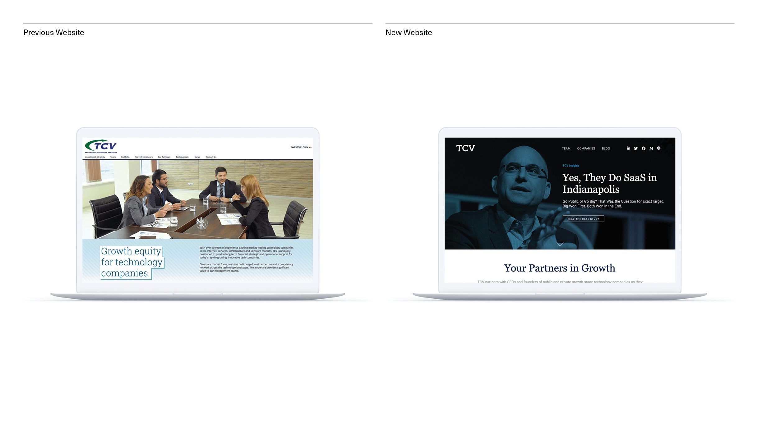
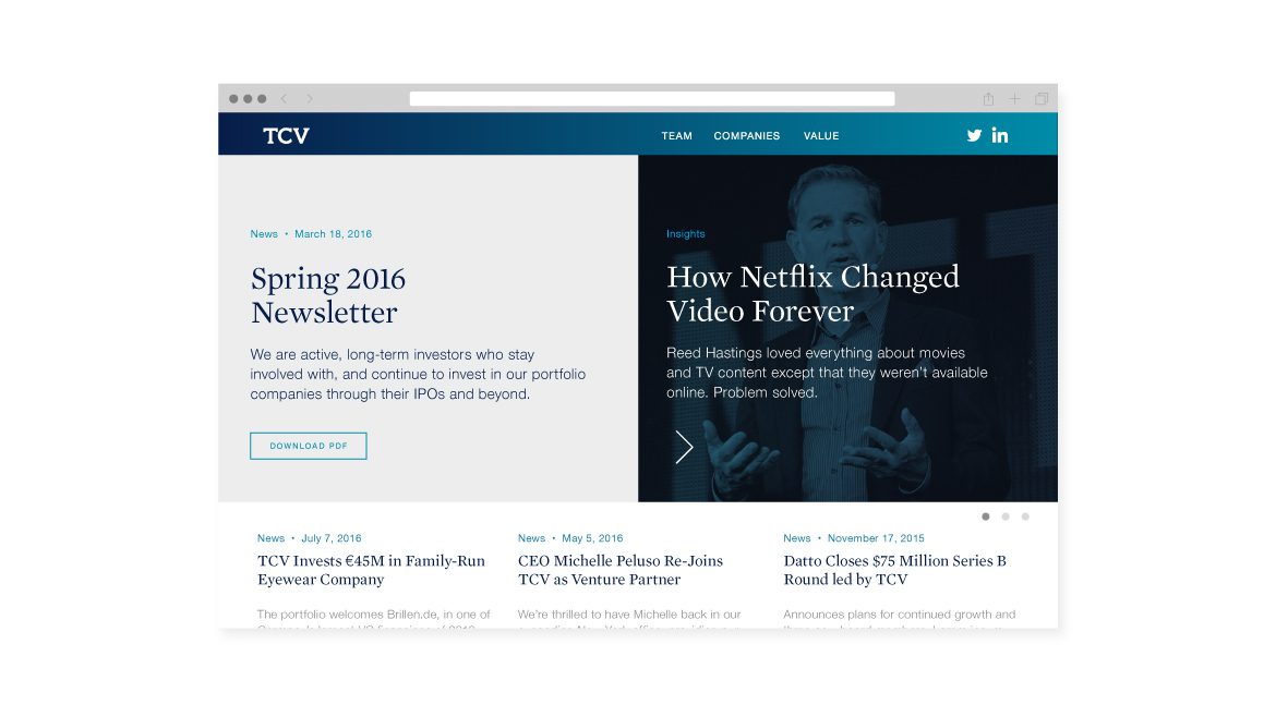
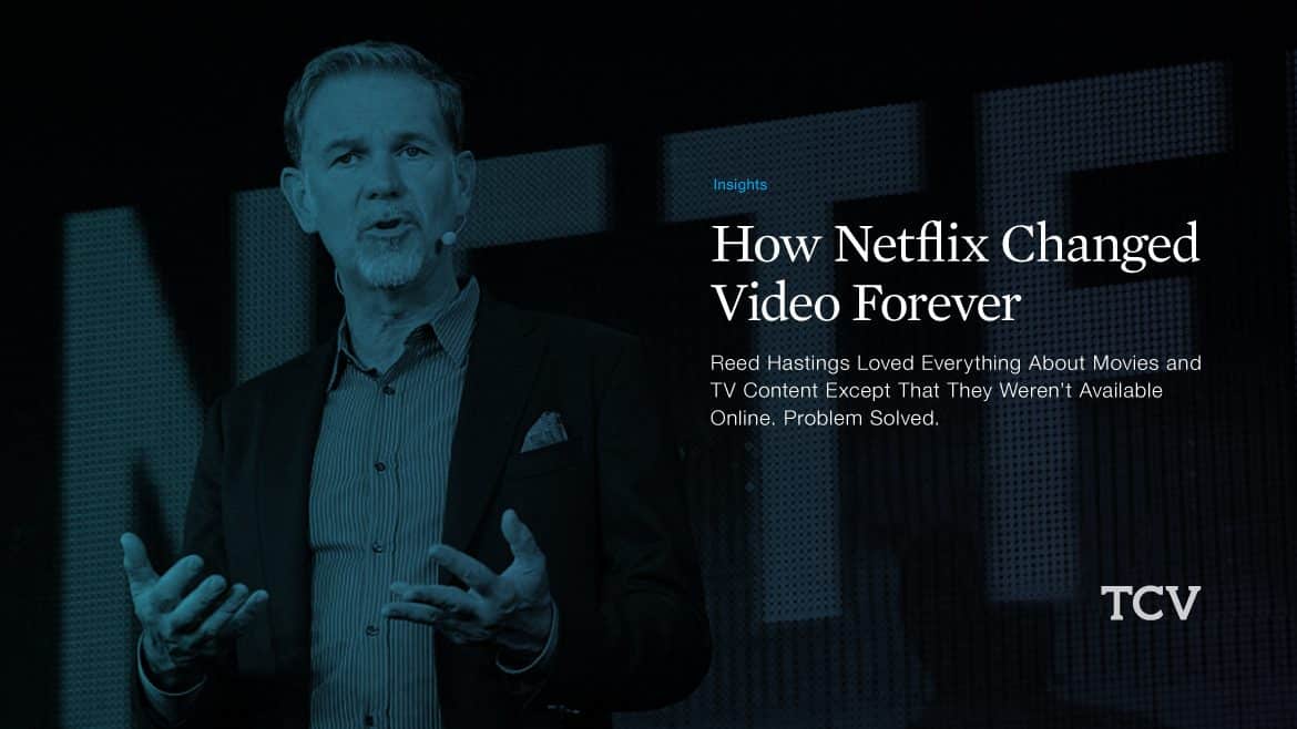
Our content strategy was to shift from inward-focus to global impact. Backed by a impressive $2.5 B fund, TCV was poised to make news. To help them lead the conversation, we built their site as a media platform for broadcasting updates about their investment companies. Visually, the brand went big: Images of TCV-backed CEOs taking the stage was the new normal.
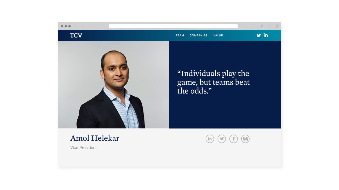
We proposed a selection of case studies that satisfied curiosity about success, while reinforcing TCV’s key values, and a totally re-imagined site structure and design. Navigation was reduced to three sections: TEAMS / COMPANIES / VALUE, which reinforced TCVs rebranded initials.
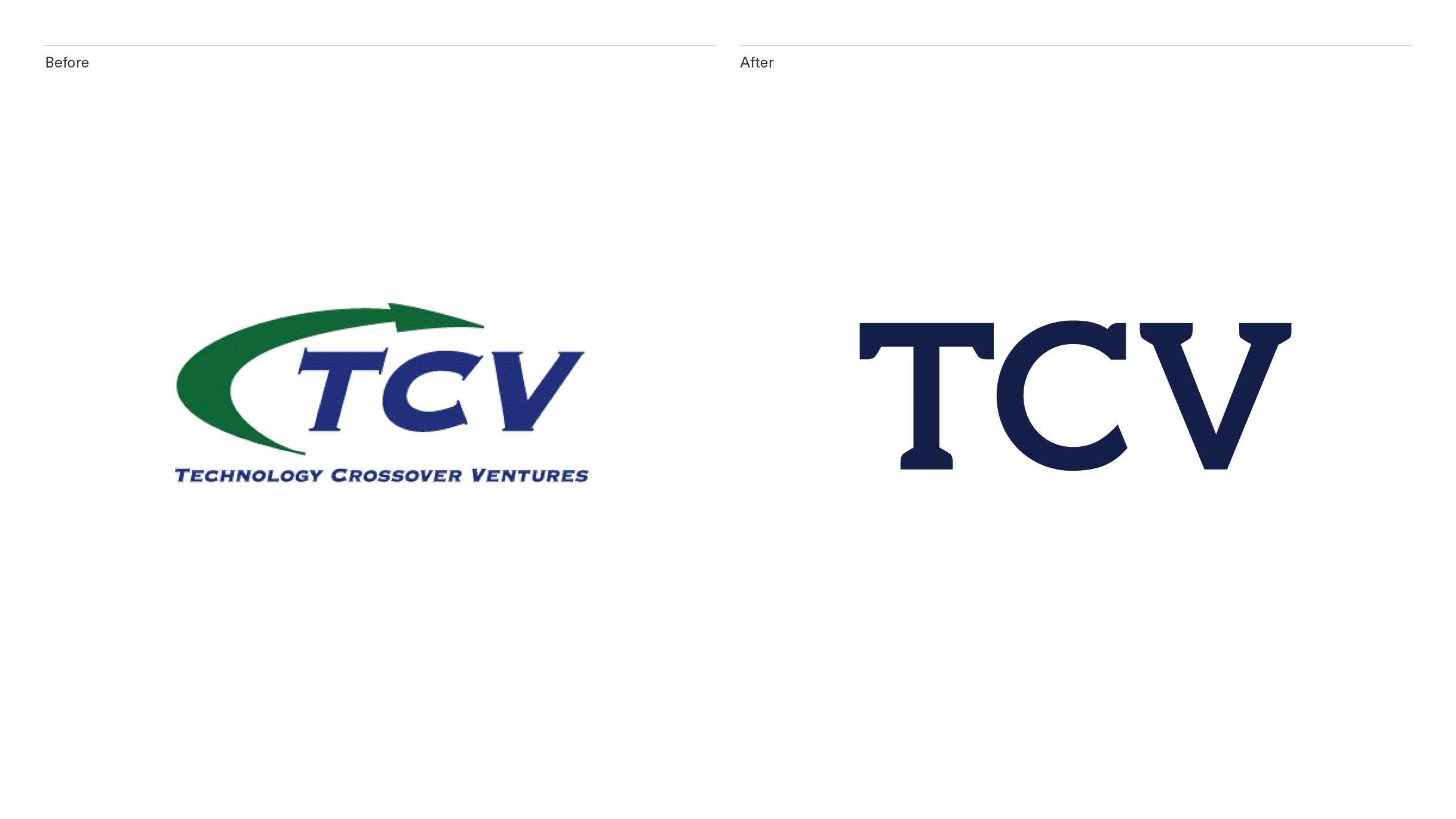
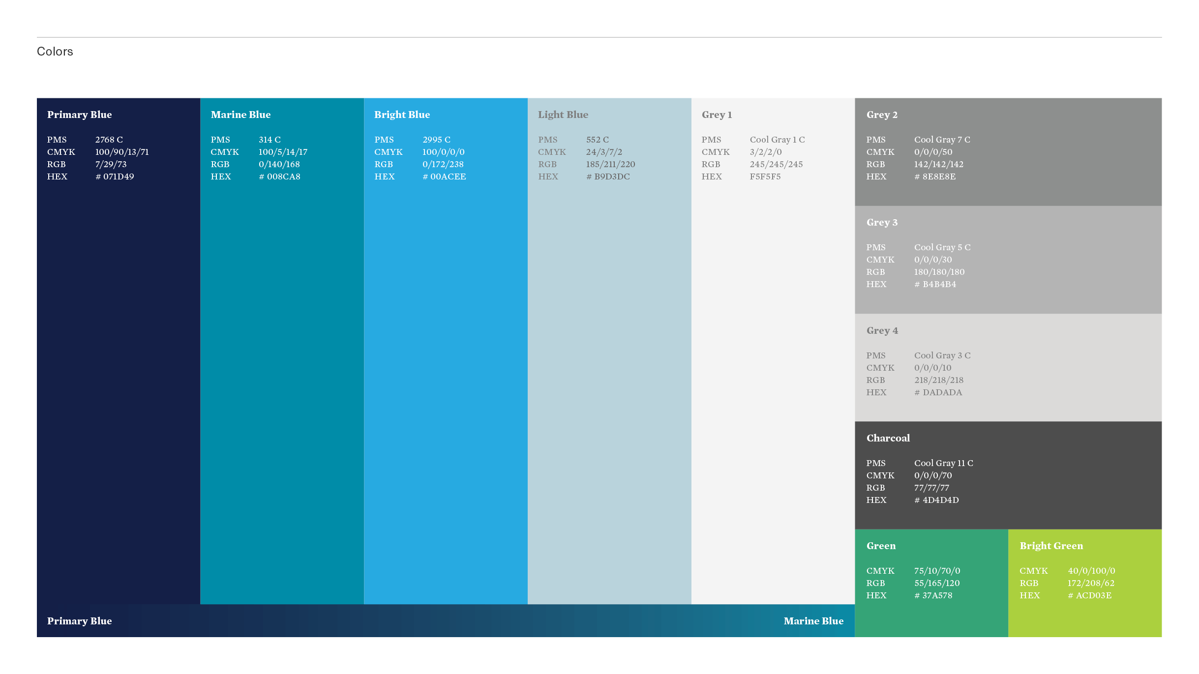
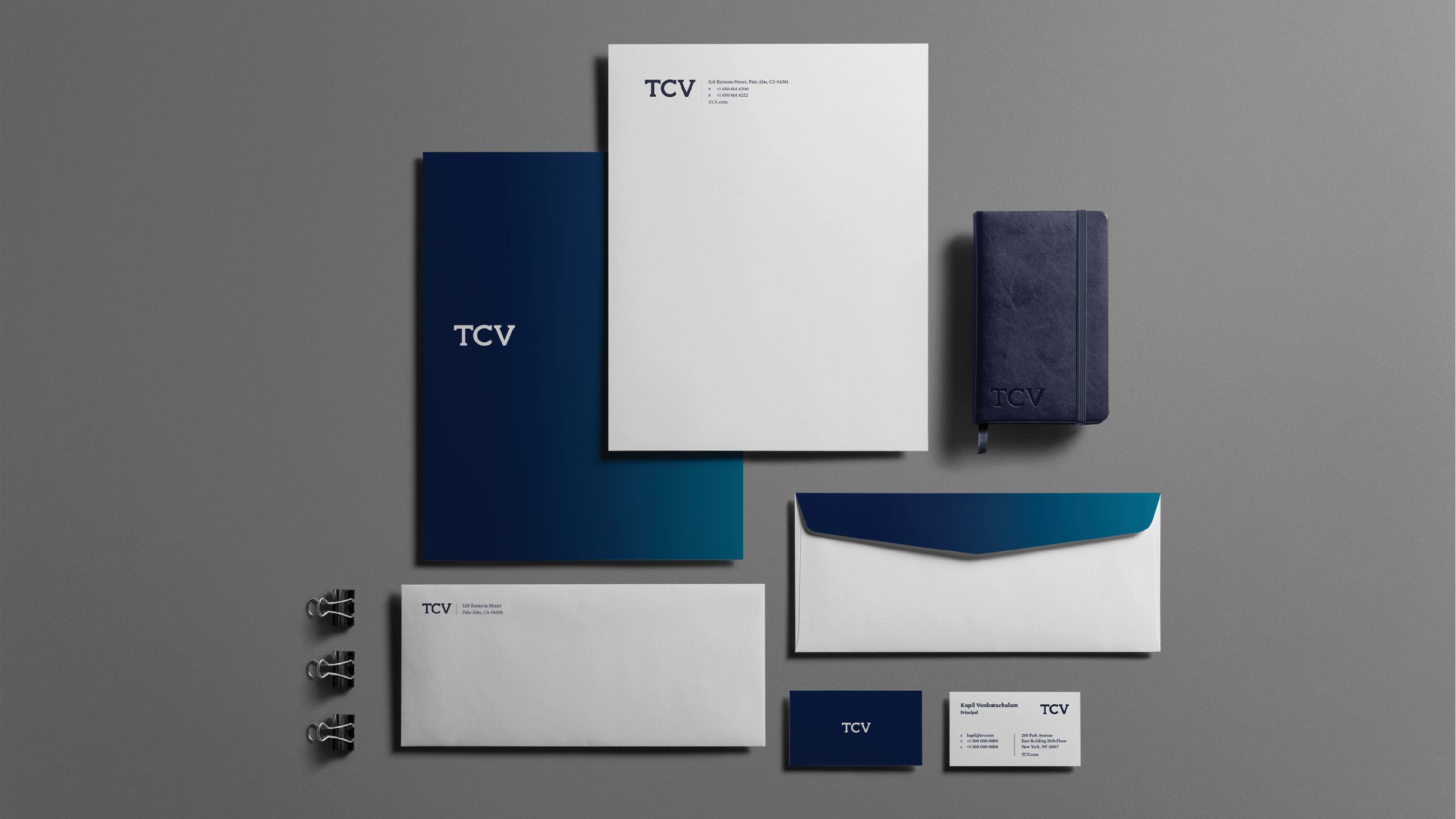
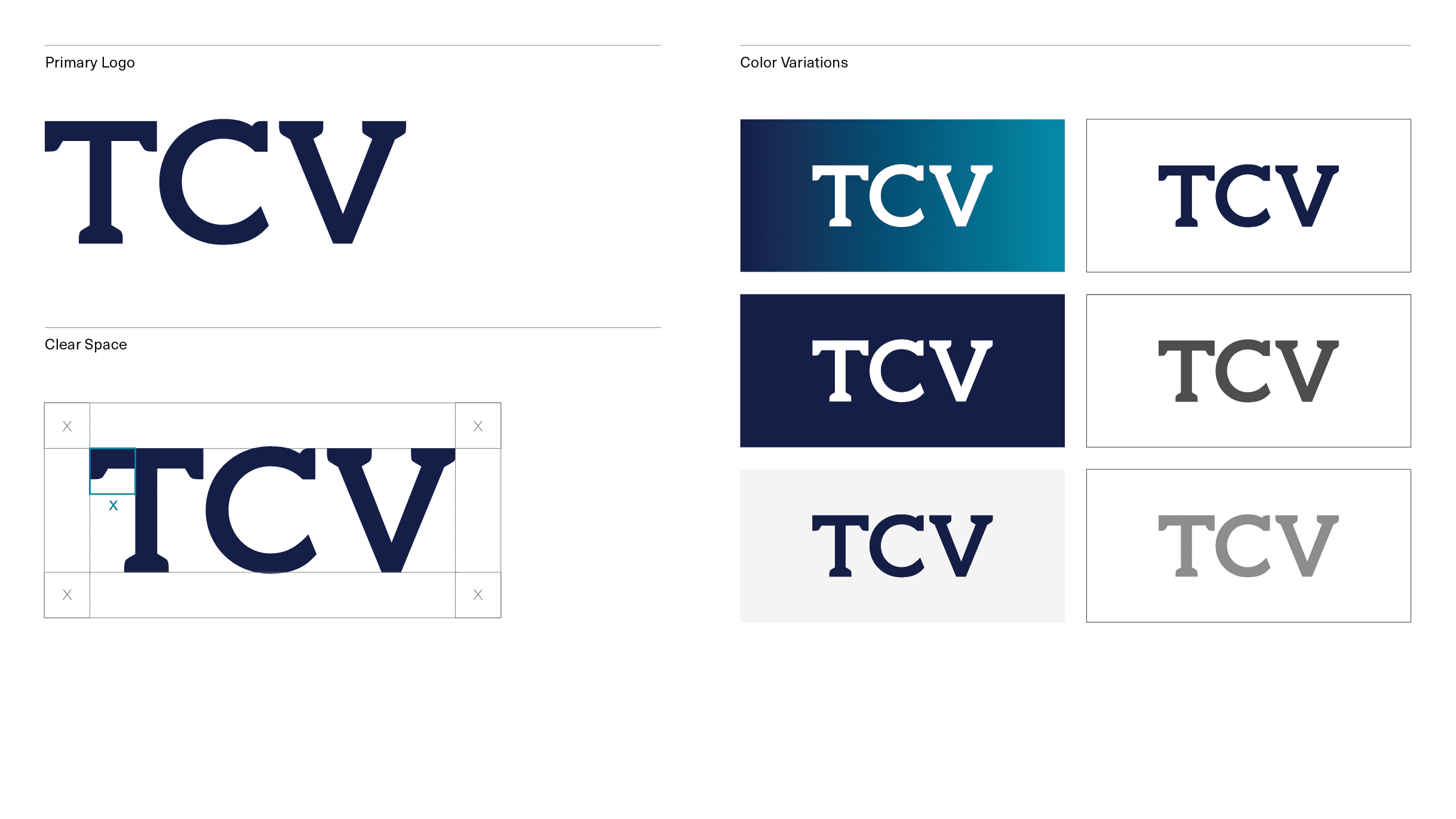
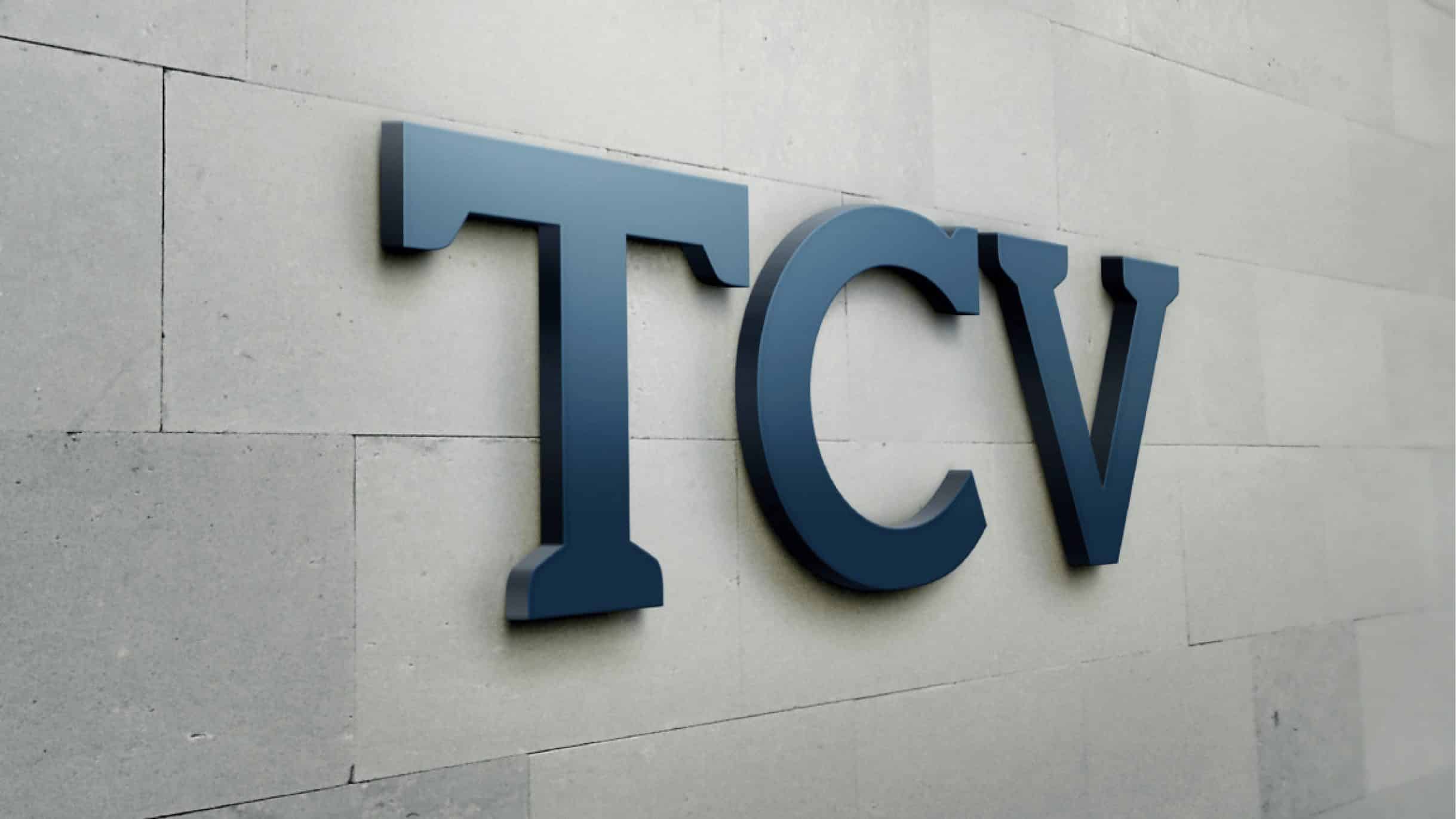
The logo and visual branding needed to be totally overhauled, as our discussions with key stakeholders quickly confirmed. Our assessment was that the new visual identity should reflect the reliable TCV reputation, more on the side of “growth” (mature, confident, anchored) than “tech” (trendy, brash, eclectic). The resulting custom-drawn initials are clear and solid, with a nod to classic letterforms. To this we added an austere blue color palette, business system, style guides, and materials specs for signage, to ease distribution across several offices in the US & UK.
